• Changing RCF's index page, please click on "Forums" to access the forums.

Browns Adding to Game Day Experience

Do Not Sell My Personal Information
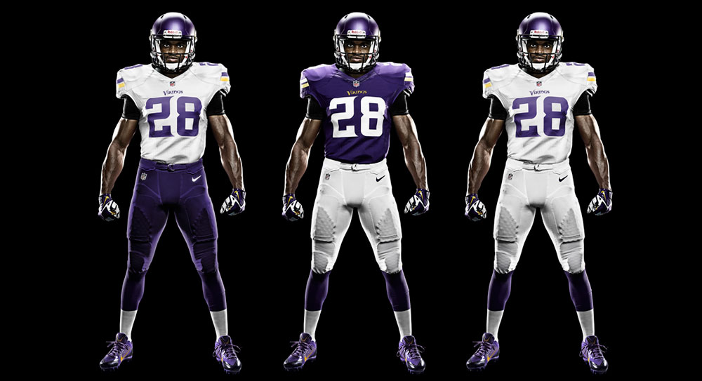
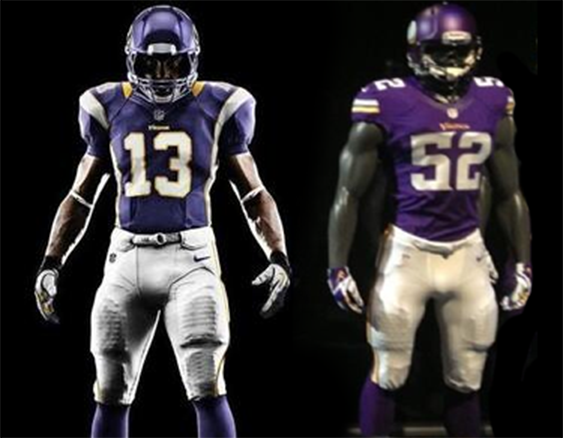
This has been mentioned but compare to the Seahawks' stripes on the front of their jerseys.

Their stripe seems like it is better integrated in to the contour of the jersey and it is just a single color. I realize these crappy fan jerseys will not look like the authentics, so I'll wait and see but it's just "meh" for me.

To me, it looks like they got caught in-between where they were trying to change them but not change them too much. That is typically when you end up with something that is a bit uninspiring. The actual jersey will always look better than mock ups or replicas but it seems like they could have done something a little more unique without completely dumping on tradition.

I'm not bitching to bitch, it just seems like we were even meddling with the jerseys. Nike has done some really nice stuff recently with redesigns and this one seems like one of their worst efforts. I doubt that is a coincidence given some of the snide comments by people within the FO when the "new" logo was released.
One thing to remember though is that the Browns considered feedback from fans across the region, young and old. Many of which likely wanted to keep the traditional look. You will never please everybody and if you expected a massive overhaul like the Seahawks, then you were misled.

This team has tradition to uphold - teams like JAX, Tampa, and Seattle do not and can afford to implement drastic changes without risking major backlash from the older generation of fans.
 
They look fine, will look better on the players. Lest we forget, they are finally using orange as a jersey and pants color. Any more changes and they'd look dumb.
 
Also, calling this one of Nike's worst attempts?

You apparently aren't familiar with the uniform revamps in Jacksonville, Tampa, Miami.

This Browns update is probably their best attempt since Seattle in 2012.
 
Were people actually able to buy them when they were up? Lmfao so much for keeping it under locks.

Yes, they were available to buy. My friend is the one who took the picture of the empty rack, sent the pic as a text to Zac Jackson, and was the last customer able to hold it and take pictures of it and with it. He said that the store clerk did not know they weren't supposed to go out yet (did not read the email). And immediately pulled them off the rack. He also said that particular store got them in this past Friday.

Someone at the store at the time was the one who told the store clerk they didn't think they were allowed to sell them yet. And that's when the guy got nervous. Came back with a red face and immediately pulled the jerseys.
 
Last edited:
What is all this bitching about horizontal stripes? They better be horizontal.

I think they will look nice on Tuesday. People LOVE to shit on the Browns. Most of it is well deserved, but when people find bullshit like this to bitch about it bothers me. Quit whining about nothing.

The fans stressed to ownership that they did not want a big brand change. You'd think people would burn down First Energy Stadium with the way they were freaking out about a possible helmet change. So ownership decides to merely modernize the classic look and now the same people are out with pitchforks. "CLASSIC BROWNS!" Literally though, that's what you were all asking for...

The authentics will look sharp but the shit storm was inevitable from the beginning.
They should have never worried about the guys with one foot in the grave and just gone with a new dramatic look that looked great.
 
They should have never worried about the guys with one foot in the grave and just gone with a new dramatic look that looked great.

I'm sure a lot of the old timers won't like all the orange, so it is a decently sized step forward.

I'm with you in a sense though that I would have liked to have seen the gray look that was rumored, and hopefully we will get some sort of alternate like that in the future.
 
Really, @el_capitan ....these weren't done well?

cTJucdL.jpg
 
Also, calling this one of Nike's worst attempts?

You apparently aren't familiar with the uniform revamps in Jacksonville, Tampa, Miami.

This Browns update is probably their best attempt since Seattle in 2012.
The Dolphins new jerseys are much better than the previous iteration.
 
Are you guys so consumed about the stripes of the jersey to not notice the change in color of the home jersey?

:conf (11):
 
They are average I guess. Nothing amazing IMO.

As a Vikings fan, 100% disagree. They knocked it out of the park. Returned back to the dark purple from when the Vikings were 1st founded and had their best years. So much better than the previous jerseys, so much better than the Moss/Carter jerseys...might even be better than the Purple People Eaters jerseys and those are my favorite jersey of all time. Guess everyone can't have the same taste.
 
From the outside looking in, definitely an improvement and I like the matte helmet.
DjlfL5Z.png


Browns makeover is better. :greets (13):
 
From the outside looking in, definitely an improvement and I like the matte helmet.
DjlfL5Z.png


Browns makeover is better. :greets (13):

From the outside looking in, I don't get the Browns makeover. One of the most iconic jerseys in the game doesn't need to be changed that much IMO. I've always viewed Green Bay, San Fran, Pittsburgh, Oakland, and Cleveland as the unchangeable, easiest to identify jerseys in the game.
 

Rubber Rim Job Podcast Video

Episode 3-14: "Time for Playoff Vengeance on Mickey"

Rubber Rim Job Podcast Spotify

Episode 3:14: " Time for Playoff Vengeance on Mickey."
Top