• Changing RCF's index page, please click on "Forums" to access the forums.

My design for a new cavs logo

Do Not Sell My Personal Information
Status
Not open for further replies.

gregdawg

In the Rotation
Joined
May 24, 2010
Messages
1,177
Reaction score
511
Points
113
For a while now I've wanted a new cavs logo. When they redesigned the uniforms and court a couple of years ago, i wondered why they kept the old logo.

Here's the current logo - why are they still using this? what's with all the blue, and that old font? it just doesn't match the look of the team anymore, so why are they holding on to this thing?
New_Cavaliers_Primary_Logo_20100621152651_320_240.JPG


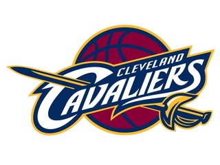
the old logo still has the old lettering font that isn't even used anymore on the uniforms. The logo also has that dark blue color which isn't even part of the current color scheme. I always wondered why they added the dark blue color a few years ago - it always just felt out of place, since the team colors are wine and gold...not wine, gold, and dark blue. most teams have just 2 main colors, not 3...so i never thought it made sense to add blue to the team colors.

cavs-uniformsjpg-4adee940584268c8.jpg


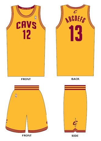
anyway, so i decided to make this new logo myself, incorporating the blocky lettering from the uniforms and sticking ONLY to the cavs TRUE colors (no b.s. blue).
my+Cleveland+Cavaliers+logo+design+sheet1.jpg


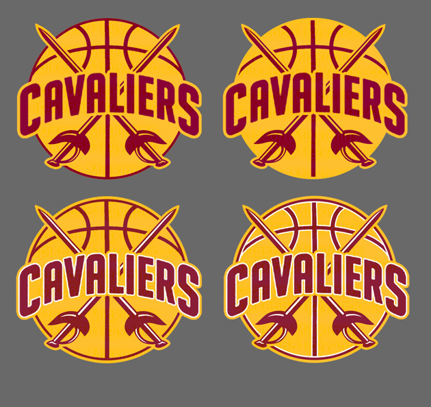
shouldn't the cavs logo reflect the current team colors and design aesthetic? wouldn't this new logo go better with the current uniforms?
 
Last edited:
dude those last two are hard as fuck.. whats the difference between them?
 
Last edited:
Never really thought about the logo having the old font. That last one is real nice
 
dude those last two are hard as fuck.. whats the difference between them?

the only difference is on the last one i added a white line around the lines in the basketball. i like them both, but i wanted to try it both ways.
 
Nice job - why they still use that logo and kept that same "C" on their uniforms (outside of the shorts, I believe) is mystery.
 
The last one is the best. What font is that?
 
Last edited:
The last one is really good. I have been wanting them to add white to the road uni's, would make them looks a million times better.
 
I like the idea. Too many teams in the league already adopted the "ball with centered letters look. The Pistons, Lakers, Clippers, to name a few)

Unfortunately, I would actually try going the OTHER direction. Instead of changing the logo to match the court, I would change the court to match the logo (circa 2005). Turn the outside of the court to the new dark wine color of our template, and have gold "CLEVELAND CAVALIERS" across the baseline. Have the semi-circle and free throw line wine, but the rest of the inside wood-colored/non-painted, then have the side boxes and top circle be yellow, three point line being blue (to cover all three colors). Add the new logo to the court and we got a new, simple, Thunder styled court.
 
I like the idea. Too many teams in the league already adopted the "ball with centered letters look. The Pistons, Lakers, Clippers, to name a few)

but the cavs' uniform lettering is symmetrical/centered, so if you're going to use the same lettering in the logo, it has to be a symmetrical/centered logo. I don't have a problem with the centered ball design. there's a reason so many teams use it - because it works. it gives it more of a classic, retro look.

Unfortunately, I would actually try going the OTHER direction. Instead of changing the logo to match the court, I would change the court to match the logo (circa 2005). Turn the outside of the court to the new dark wine color of our template, and have gold "CLEVELAND CAVALIERS" across the baseline. Have the semi-circle and free throw line wine, but the rest of the inside wood-colored/non-painted, then have the side boxes and top circle be yellow, three point line being blue (to cover all three colors). Add the new logo to the court and we got a new, simple, Thunder styled court.

wait, so you're saying they should slap the old Lebron era logo back on the court, even though the font and color don't match their current uniforms? why keep that old logo if it doesn't match the current uniforms? i say it's time to get rid of that old Lebron era logo. the team colors are wine and gold, yet there's more blue in that logo than any other color - doesn't make any sense.
 
We should probably just steal from the Lakers and replace their purple with our wine color... somehow they've managed to work with gold and make it look classy. The Cavs have never really managed it. They also don't worry about representing a "lake" in their logos.
 
Love the last one. Time to tweet Dan....
 
I wish we'd just abandon the ketchup and mustard completely and go for a nice wine color with the gold we had during the last uniforms. Almost like a Florida State look, but I suppose we'll continue rocking the physed looking field hockey jerseys.
 
We just need new colors altogether. When I think of a cavalier, I think of the silver of swords, the red of spilled blood.
 
Funny how this comes up 3 times a year and nothing ever changes.
 
Last edited:
Status
Not open for further replies.

Rubber Rim Job Podcast Video

Episode 3-13: "Backup Bash Brothers"

Rubber Rim Job Podcast Spotify

Episode 3:11: "Clipping Bucks."
Top