-
Changing RCF's index page, please click on "Forums" to access the forums.
You are using an out of date browser. It may not display this or other websites correctly.
You should upgrade or use an alternative browser.
You should upgrade or use an alternative browser.
Q Arena Renovations (scoreboard, court, ...) and In-Game Experience
- Thread starter Mott the Hoople
- Start date
Jack Brickman
Hall-of-Famer
- Joined
- Aug 12, 2012
- Messages
- 38,456
- Reaction score
- 61,544
- Points
- 148
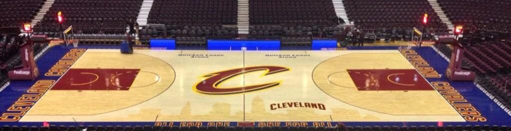
It definitely looks a lot better than the one Zach Lowe reviewed.
- Joined
- Aug 11, 2008
- Messages
- 12,566
- Reaction score
- 27,189
- Points
- 135
Wow, HUGE difference. Not a gigantic fan of the shade of blue in our color scheme, but that extra color makes a tremendous difference.
Our home court has looked whitewashed and faded for years. So drab. Really glad to see a little saturation back in there.
Our home court has looked whitewashed and faded for years. So drab. Really glad to see a little saturation back in there.
Warren G.
Westside Regulator
- Joined
- Nov 25, 2007
- Messages
- 498
- Reaction score
- 1,044
- Points
- 93
Was a 5, now a solid 7.5. They got rid of the small "impaled C" logos around the paint, which I thought were cluttery. Shifting the "Quicken Loans Arena" tags to the top of the court brings a better balance to the design, letting the "All For One" motto breathe, and also aligns them with the promo tags of "CAVS.COM" and "@CAVS." The red and yellow lettering really does look much better with the blue background. The outline of Ohio's a nice touch, too. I have a slight reservation about that "Cleveland" tag arcing over the skyline, but this is a huge improvement.
oracio
Sixth Man
- Joined
- Jul 12, 2014
- Messages
- 573
- Reaction score
- 1,437
- Points
- 93
I love the arched Cleveland, it breaks the symetry of the court, making one side different, which I think is a bold move and make it more interesting. And it also compliment very well to the huge C, giving it a meaning and something to snap to.
Jack Brickman
Hall-of-Famer
- Joined
- Aug 12, 2012
- Messages
- 38,456
- Reaction score
- 61,544
- Points
- 148
Wow, HUGE difference. Not a gigantic fan of the shade of blue in our color scheme, but that extra color makes a tremendous difference.
Our home court has looked whitewashed and faded for years. So drab. Really glad to see a little saturation back in there.
The blue makes the red pop, essentially. I also like surrounding the C with the gold. It adds a little bit more life to an otherwise boring mid-court logo. I'd still rather see the crossed swords logo at mid-court, though.
- Joined
- Aug 11, 2008
- Messages
- 12,566
- Reaction score
- 27,189
- Points
- 135
The big takeaway here....Here is the real thing (from different sources):
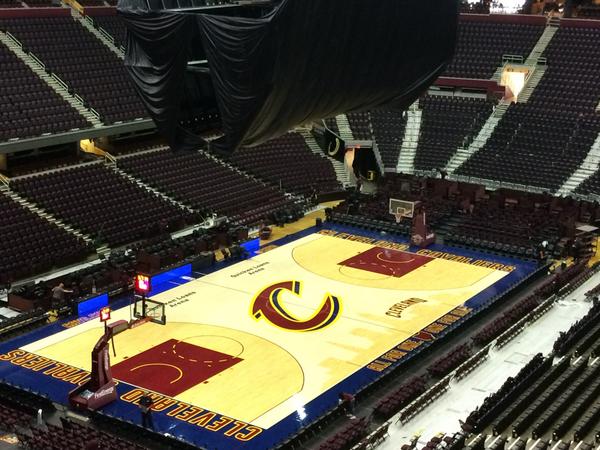
White balance your photos people. Jesus.
Don't like the "Cleveland" above the skyline but it looks good otherwise.
Yeah, it would be a lot better without that.
cliffdawg
Sixth Man
- Joined
- Feb 21, 2008
- Messages
- 2,302
- Reaction score
- 2,376
- Points
- 113
I like anything with the word Cleveland and it......just sayingYeah, it would be a lot better without that.
Binkster
A Five Star Man
- Joined
- Aug 24, 2008
- Messages
- 8,079
- Reaction score
- 11,245
- Points
- 123
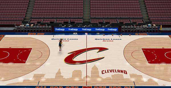
I'm pretty sure that first one is a screengrab from NBA 2K15 or something, no?The big takeaway here....
White balance your photos people. Jesus.
Binkster
A Five Star Man
- Joined
- Aug 24, 2008
- Messages
- 8,079
- Reaction score
- 11,245
- Points
- 123
Can we rename this thread something like Q Arena Renovations and In-Game Experience, yada, yada, yada?
We've got a new floor, new scoreboard, new video boards, new facade signage, new roof on the way, 3D pregame presentation, etc.
We've got a new floor, new scoreboard, new video boards, new facade signage, new roof on the way, 3D pregame presentation, etc.
Rubber Rim Job Podcast Video
Episode 3-13: "Backup Bash Brothers"
Rubber Rim Job Podcast Spotify
Episode 3:11: "Clipping Bucks."