Jack Brickman
Hall-of-Famer
- Joined
- Aug 12, 2012
- Messages
- 38,456
- Reaction score
- 61,544
- Points
- 148
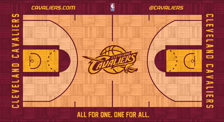
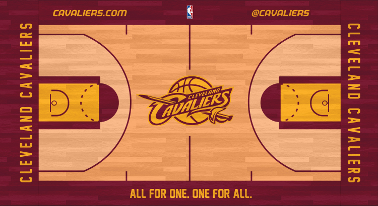
I love that people on this board can spend like fifteen minutes designing a court that looks significantly better than the one that (presumably) was professionally designed.