The Browns changes are like watching car commercials. In every single car commercial, they say that this is the NEW ___, how innovative it is. Problem is, every single commercial says the same exact thing. It stales on people. Nothing to differentiate themselves from the crowd.
What pissed people off the most is their press release. When you tell some fans, especially Cleveland fans, that
a brown facemask represents the "toughness of the city.." Are you serious? You could have attributed this to any color, or any change, a change of color means absolutely nothing, you don't have to make a remark as cheesy, and played out as that. Changing a facemasks color to shit brown means you are paying homage to the toughness of a city?  Is that what your focus group said to say?
 Also every Cleveland team has used this approach already. "GAWD, THE CITY IS SO TOUGH. LETS USE SOME BLACK/WHITE GRITTY INTRO, MAYBE A SHOT OF LIKE THE 2 FACTORIES WE HAVE STILL IN CLEVELAND, AW FUCK YEAH. Oh yeah, sorry we suck again." FUCK OUTTA HERE.
Oh yeah, you guys are so tough, we changed your dog logo, that represents an entire fanbase from a bulldog to Scrappy Doo, haha cause ya know.. fuck you.. Cleveland fans have seen all of the PR bullshit there is, and The Browns pull the one out that NEVER works on people, yet for some reason it KEEPS BEING USED because these dumbasses have ran out of ideas. There is actually statistical proof as well that saying these dopey ass buzzwords never works, because they use the same phrases over and over and over and over and over again.
I'd like to see if the Browns PR Department has somebody working there under the age of.. I don't know, 50?
HASLAM:
It's kind of insulting considering all they are talking about is "NEW Browns, NEW team, NEW era,"
When the Browns PR department, their management, their creative team had their heads buried in all the numbers, statistics, advanced pie graphs, 30 feet up their ass..
They never looked up from them. This is why you see fans continuously concepting new designs that are miles ahead of what the team actually puts out. THEY ARE TOO BUSY LOOKING AT FUCKING CHARTS, AND NOT THINKING CREATIVELY, SETTING THEMSELVES UP FOR FAILURE.
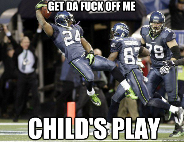
People can see through bullshit. IT'S DAMN CHILD'S PLAY! HELLO? EARTH TO THE BROWNS? HAVEN'T YA'LL TAKEN AN ENTRY LEVEL COLLEGE MARKETING CLASS?
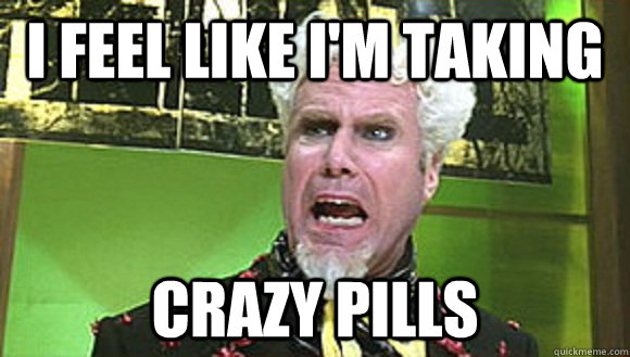
Being a Browns fan at this point is being Mugatu in Zoolander where he is the ONLY PERSON IN THE ENTIRE MOVIE WHO REALIZES ZOOLANDER (The Browns) IS USING THE SAME FACE!!!!
Gotta love these buffoons though. Just win one before the world ends.


 Is that what your focus group said to say? Also every Cleveland team has used this approach already. "GAWD, THE CITY IS SO TOUGH. LETS USE SOME BLACK/WHITE GRITTY INTRO, MAYBE A SHOT OF LIKE THE 2 FACTORIES WE HAVE STILL IN CLEVELAND, AW FUCK YEAH. Oh yeah, sorry we suck again." FUCK OUTTA HERE. Oh yeah, you guys are so tough, we changed your dog logo, that represents an entire fanbase from a bulldog to Scrappy Doo, haha cause ya know.. fuck you.. Cleveland fans have seen all of the PR bullshit there is, and The Browns pull the one out that NEVER works on people, yet for some reason it KEEPS BEING USED because these dumbasses have ran out of ideas. There is actually statistical proof as well that saying these dopey ass buzzwords never works, because they use the same phrases over and over and over and over and over again.


