• Changing RCF's index page, please click on "Forums" to access the forums.

Zach Lowe: Cavs have the worst court design in the NBA

Do Not Sell My Personal Information
Status
Not open for further replies.
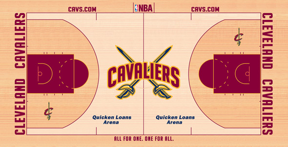
Personally, I'd like to see this logo at center court rather than the stupid giant C.

1000006758_000_600X.jpg


And then this logo inside the three point arcs:

cavs.gif
 
The big C is whatever. I really liked the giant script from our last playoff runs and our logo is good for a court design as well.

Celtics are WAY overrated, but for me that's cause I think parquet is ugly as fuck.
 
Ours isn't great.... but I think Minny's is worse. I like Charlotte, Philly, and Atlanta personally.
 
Oh well... I don't think it's the worst, but that has a lot to do with my fanhood. I'm sure to a non-fan it looks like shit, just like I think that many of the ones from 15-29 are awful. Still, I at least enjoyed seeing all of the court designs in one place.
 
Unless Zach Lowe has some sort of graphics design and marketing background this is just an opinion piece from a man with no expertise on the subject. I seem to remember this guy taking quite a few dumps on the cavs in the past.
 
Unless Zach Lowe has some sort of graphics design and marketing background this is just an opinion piece from a man with no expertise on the subject. I seem to remember this guy taking quite a few dumps on the cavs in the past.

When Lowe really goes in depth with his criticisms on NBA teams and breaks down their play calls or what isn't working, he's really fantastic. Sadly, that's meant he's been incredibly harsh on the Cavs over the past 2 years whenever he puts them under the microscope. To his credit though, Lowe has repeatedly admitted to being a fan of Dion Waiters over the past 2 years (though he rags on him constantly for not getting back on defense after he misses a shot) and defended Anthony Bennett back when every national pundit was still crapping all over him. He's pretty fair, but these things have just been nothing more than his opinion. Last year he choose Utah Jazz as one of the very best names in the NBA - and I lived in Salt Lake, I assure you there ain't no jazz to be found.
 
I like this court, except make the crossing swords much smaller.

cavs_court_2011.jpg
 
We are going to have the best record, and that is all that matters.
 
People are saying on here that they love our color scheme and I agree… BUT the court doesn't utilize our color scheme at all. Where is the gold???
 
People are saying on here that they love our color scheme and I agree… BUT the court doesn't utilize our color scheme at all. Where is the gold???
Everything from our uniforms to our court design screams scream "rec league".
We're gonna be one of the flashiest teams in the league, so it would be nice to look like it too.
 
People are saying on here that they love our color scheme and I agree… BUT the court doesn't utilize our color scheme at all. Where is the gold???

Whenever I hear "Cleveland Cavaliers" the first color that comes to mind is that Wine Red which I imagine is our primary color. I agree though, more gold on our court and uniforms would be nice.
 
Whenever I hear "Cleveland Cavaliers" the first color that comes to mind is that Wine Red which I imagine is our primary color. I agree though, more gold on our court and uniforms would be nice.
Maybe make the key gold and keep the half moon above the key red, or vice versa.
 
Don't take this so personally. While it is completely opinionated, Lowe is one of the best minds in the NBA in terms of reporting.
 
Never had a problem with Lowe's take on the Cavs. He's never really been wrong. Seems like the big thing people around here knock him for is the article he wrote after the Cavs won the 2013 lottery. All he really did was point out how the Cavs were celebrating being lucky and bad. He wasn't wrong.

This is an article people really shouldn't even take seriously. There's nothing going on, so he's having a little fun. Something like this is completely subjective. I don't think the Cavs have the worst court design in the league, but let's be honest, it's not that great. It would be better if they used the main logo rather than the C at midcourt, and it is way too big. I can't tell if there's too much wine, or not enough. Maybe it's the color they use for the wood. I don't know. I do think it needs more gold.

Personally, I was always a fan of this:

court_061004_600.jpg


Maybe do something like that, but replace the blue with gold?
 
Are we gonna get mad about his criticism of our team name and his analysis of Space Jam as well? Who cares? His opinions about the actual team is great!
 
Status
Not open for further replies.

Rubber Rim Job Podcast Video

Episode 3-14: "Time for Playoff Vengeance on Mickey"

Rubber Rim Job Podcast Spotify

Episode 3:14: " Time for Playoff Vengeance on Mickey."
Top