• Changing RCF's index page, please click on "Forums" to access the forums.

Zach Lowe: Cavs have the worst court design in the NBA

Do Not Sell My Personal Information
Status
Not open for further replies.
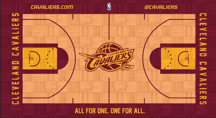
Swap the colors of the midcourt logo, and we've got a winner.
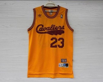
You mean like this?

g4WJc1l.jpg


LxHTuZb.jpg
 
I like the one with the swapped colors better than the original.

I also think you should change the font for the text on the sidelines. I'm not sure what you're using right now but I'm not a big fan of it.
 

Couldn't agree more... Just so everyone knows if they didn't click. My favorite jerseys as well.

il_340x270.627013225_gjp9.jpg
 
I'm OK with the current design as people are still looking at it in June. If they aren't, it sucks.
Like, it's not going to stop me from going to games but it isn't the nicest of court designs.

I know they're doing a severe makeover, inside and especially outside (buddy of mine's firm won the bid). He told me it's going to look cumpletely different - "ridiculous" was his exact word.
 
Well hed sure look stupid if he bashed us for our team now so hey......


Our court design sucks lol


Dudes reach so hard. Does he have a backround in large scale design or something?
 
Well hed sure look stupid if he bashed us for our team now so hey......


Our court design sucks lol


Dudes reach so hard. Does he have a backround in large scale design or something?

For the 20th time he's not bashing Cleveland, he just doesn't like our simple court design. The article was an enjoyable offseason piece that some are taking way too seriously.

Lowe is one of the best NBA writers out there, let's appreciate his work until an NBA team hires him away from Grantland.
 
The biggest problem with the Cavs court is how intolerably bright the non-wine wood is. I have it as the worst in the NBA too, as if you try to watch a game (or even worse play on 2K) with too bright of a setting on your TV you literally run the risk of burning out your retinas.

If they got rid of the obnoxious almost white wood color the court would be whatever/average, but until the it's brutal.

That said (and I love Lowe) he's sniffing something crazy if he likes that mess the Nets have as a wood base.
 
Last edited:
For the 20th time he's not bashing Cleveland, he just doesn't like our simple court design. The article was an enjoyable offseason piece that some are taking way too seriously.

Lowe is one of the best NBA writers out there, let's appreciate his work until an NBA team hires him away from Grantland.
Enjoy his work, while hes shitting on our court?

I was just making jokes about him your the one that obviously got serious about it lol
 
I totally respect Zach Lowe's basketball writing, but maybe not his design sensibilities!

At least with the giant "C", they made a design choice. Its different than all the other courts. Whether that is good or bad seems to just be a matter of taste. The most successful or popular courts and logos, seem to be the classic, timeless ones.

If you're asking me, nothing is worse than OKC or Utah's logos and courts!
 
For those who don't like the blue, this court is a bummer haha. I like it, though.

Do I see the skyline on that court?

Also, Dan Gilbert and some Cavs people must of read this thread or something :chuckle:

That appears to be the skyline
 
I like incorporating more blue, personally. The skyline is the clincher, for me.

This city's residents are its toughest critics, but at the end of the day it is a very proud city. I think it's good to represent that somewhere.
 
Last edited:
Status
Not open for further replies.

Rubber Rim Job Podcast Video

Episode 3-14: "Time for Playoff Vengeance on Mickey"

Rubber Rim Job Podcast Spotify

Episode 3:14: " Time for Playoff Vengeance on Mickey."
Top