-
Changing RCF's index page, please click on "Forums" to access the forums.
You are using an out of date browser. It may not display this or other websites correctly.
You should upgrade or use an alternative browser.
You should upgrade or use an alternative browser.
ATL Hawks new uni's. Thoughts?
- Thread starter glockcoma
- Start date
- Joined
- Aug 11, 2008
- Messages
- 12,566
- Reaction score
- 27,189
- Points
- 135
They tried to be cutting edge and fell flat.
I don't mind a modern look. This looks like they grabbed a 90's jersey, almost sent it to press, and said "Oh wait!! We forgot to put some Seahawks on it!"
One of the Hawks' people (I believe) said something to the effect of "People over 30 are gonna hate it. People under 30 are gonna love it." I totally disagree. I love the idea of a modern look in unis. But this was just bad execution. Bad color palette, bad style hits all over the jersey.
Saw someone online (can't remember who) that made a good point. There is a difference between great design (which can be timeless) and great fashion (which can be out of style super quickly). This is fashion. And not even really good fashion.
Otsego Mar
Master
- Joined
- Feb 14, 2009
- Messages
- 20,839
- Reaction score
- 15,035
- Points
- 123
I am not completely sold on the colors, but at least they don't look so generic. I don't hate it.
I agree....the colors (the lime green??) are a bit iffy. But I hate how jerseys seem to be going super generic - look at the new clips uniforms, and I'm not exactly thrilled with how the Cavs unis look either.
-Akronite-
Hall-of-Famer
- Joined
- Jul 3, 2008
- Messages
- 11,007
- Reaction score
- 14,455
- Points
- 123
The ATL would be better is the weird indent was the negative space Hawk like their primary Pac-man logo.
Last edited:
Helium filament
Gold Star Member
- Joined
- Jan 16, 2015
- Messages
- 1,948
- Reaction score
- 2,260
- Points
- 113
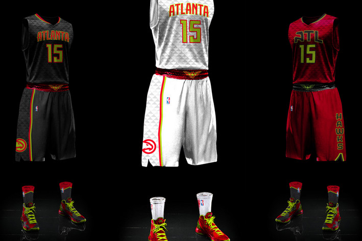
here's a pic with the shorts. i DO like the socks, can't wait to see how ours look with our uniforms.
glockcoma
In the Rotation
- Joined
- Aug 20, 2008
- Messages
- 2,290
- Reaction score
- 979
- Points
- 113
Worst in the NBA, see Clippers, they have a logo that kindergartners drew up, and that already takes the cake.
These Hawks threads are something different. Black jerseys are always something good to have.
It's mainly just the pattern throwing me off, but its different.
Yeah I missed the Clips reveal, so here it is for those who may have missed it.
EdMonix11
All-Star
- Joined
- Jun 2, 2012
- Messages
- 5,029
- Reaction score
- 5,777
- Points
- 113
Yeah I missed the Clips reveal, so here it is for those who may have missed it.
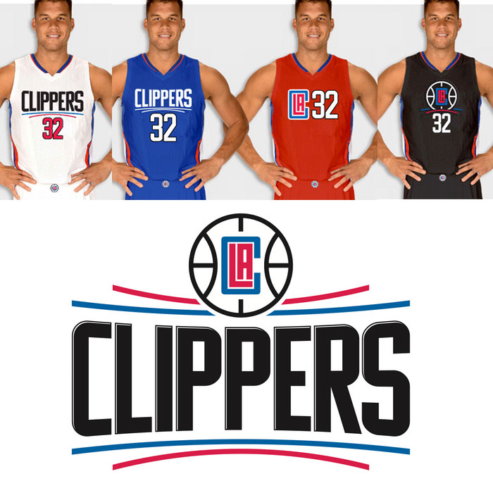
I could have taken a dump and smeared it around the front of the jersey and still done better than the Clippers.....
- Joined
- Aug 20, 2005
- Messages
- 36,613
- Reaction score
- 93,448
- Points
- 148
Atlanta once made this happen:

And this happened the same year:

Never be surprised when The Atlanta Hawks marketing team gets all feisty and creative.
And this happened the same year:
Never be surprised when The Atlanta Hawks marketing team gets all feisty and creative.
- Joined
- Apr 21, 2005
- Messages
- 18,554
- Reaction score
- 48,864
- Points
- 148
Hawks killed it from the 80's till '99.... But this is just terrible.
The Clippers situation is great cause it's the Clippers... In fact, they should have made their jerseys Purple and Gold to really screw it up...
The Clippers situation is great cause it's the Clippers... In fact, they should have made their jerseys Purple and Gold to really screw it up...
Snarly
Count Duckula.
- Joined
- Feb 18, 2009
- Messages
- 10,039
- Reaction score
- 4,505
- Points
- 113
here's a pic with the shorts. i DO like the socks, can't wait to see how ours look with our uniforms.
Look at the bright side... Will will never have to see them in the NBA finals.
Rubber Rim Job Podcast Video
Episode 3-14: "Time for Playoff Vengeance on Mickey"
Rubber Rim Job Podcast Spotify
Episode 3:14: " Time for Playoff Vengeance on Mickey."