-
Changing RCF's index page, please click on "Forums" to access the forums.
You are using an out of date browser. It may not display this or other websites correctly.
You should upgrade or use an alternative browser.
You should upgrade or use an alternative browser.
The Gold is Golder: New uniforms to come?
- Thread starter ajz20
- Start date
- Joined
- Aug 11, 2008
- Messages
- 12,566
- Reaction score
- 27,189
- Points
- 135
I would love, love, love this.Navy and Yellow jerseys will probably be our primaries this year. Sleeved jersey at Christmas and the two old school throwbacks as alternates.
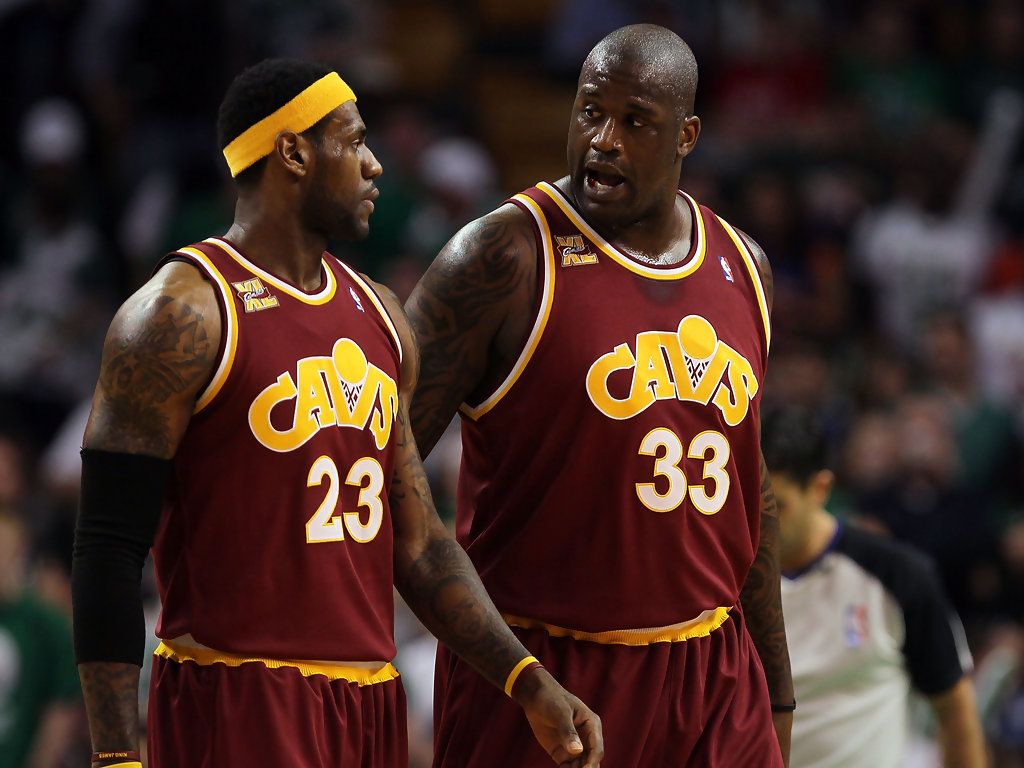
Gold homes, Navy roads, wine alternates and throw the whites in the garbage.
Also, the Xmas jerseys were already revealed. They are not sleeved. That sleeved one will be a different night.
Ohio
Woosah
- Joined
- Dec 14, 2011
- Messages
- 41,943
- Reaction score
- 48,807
- Points
- 148
Absolutely.I would love, love, love this.
Gold homes, Navy roads, wine alternates and throw the whites in the garbage.
Simon
Hall-of-Famer
- Joined
- Apr 6, 2010
- Messages
- 16,376
- Reaction score
- 20,465
- Points
- 135
So glad these are back
For sure buying that jersey this season. I loved those. Glad these are back.
N7RobBob
Crazy Cat Man
- Joined
- Aug 11, 2008
- Messages
- 3,719
- Reaction score
- 5,114
- Points
- 113
i've been waiting for a complete redisign before i buy another jersey, but with Mo coming back I may jump the gun. Nice to have a jersey with my last name on it so it's never really out of style then.
But those wines with the 90's classic font are nice...
Have we any confirmation what Mo's new number is?
But those wines with the 90's classic font are nice...
Have we any confirmation what Mo's new number is?
EdMonix11
All-Star
- Joined
- Jun 2, 2012
- Messages
- 5,029
- Reaction score
- 5,777
- Points
- 113
Not Cavs jersey related, but did anyone else see that the Pacers are going to wear Hickory High throwbacks this season? They look pretty cool.
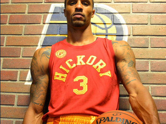
Nothing like honoring a fictional high school.....
enigmatic
Recluse
- Joined
- Jun 25, 2008
- Messages
- 615
- Reaction score
- 705
- Points
- 93
Those are from the Ted Stepien years, which I've tried to block out of my subconscious.
I have needed this one for my collection for awhile. Good stuff.
There is a really ugly one from the early 80s that I need as well

- Joined
- Jul 14, 2014
- Messages
- 4,157
- Reaction score
- 10,384
- Points
- 123
What's with the pyjama t-shirt design? I feel like it'd make an awesome infants jump-suit (with the big 'C' logo emblazoned in the middle) but as a basketball jersey? We're about to look a little silly. Fingers crossed they rarely wear this, especially given the fact that they're bringing back that awesome wine throwback jersey along with the gold 'Austin Carr' jersey as well.
Soda
Listen To The Kids!
- Joined
- Feb 21, 2008
- Messages
- 15,063
- Reaction score
- 13,184
- Points
- 123
For anyone who keeps up with this annually, what do "stretch" and "pride" mean?
As far as this year's crop goes, I like what I see thus far. I am not a fan of the "pride" one, but that's it. That's not to say that I can't like it more when I see it actually on the players.
As far as this year's crop goes, I like what I see thus far. I am not a fan of the "pride" one, but that's it. That's not to say that I can't like it more when I see it actually on the players.
citizentino
Rookie
- Joined
- Jun 7, 2010
- Messages
- 121
- Reaction score
- 87
- Points
- 28
For anyone who keeps up with this annually, what do "stretch" and "pride" mean?
As far as this year's crop goes, I like what I see thus far. I am not a fan of the "pride" one, but that's it. That's not to say that I can't like it more when I see it actually on the players.
From the adidas NBA spring catalog:
Stretch: "Teams may elect to modify their primary road uniform. All trim will remain the same." (Note: Most teams use this as the loophole for creating foreign-language versions of their uniforms.)
Pride: "Can be more exploratory in design and used to celebrate something local to that team or region. Will be a short-sleeved silhouette, and will be worn at least one time and a maximum of six times." (Translation: "Any lame excuse we can come up with to shoehorn you into a sleeved jersey for a few games a year is good enough for us.")
That stretch jersey is going to sell like crazy. Not sure why they wouldn't use the number font to match the old 'Cavs' logo like they did in 2009-10, but it's a minor quibble.
I generally hate the sleeved uniforms, but a suggestion I saw to design them more like soccer jerseys (think team crest on the chest instead of a giant logo across the entire front) would make them *slightly* more palatable.
Real Deal
Hall-of-Famer
- Joined
- Apr 21, 2008
- Messages
- 48,492
- Reaction score
- 48,967
- Points
- 148
I would love if they made that Cavs hoop logo on the gold's as well. Somebody pointed out before that the navy's will now read Cleveland instead of Cavs.
I don't know though it's just something about that wine jersey with Cavs hoop logo, I wish they put it on the gold one as well. It doesn't have to be our team logo, but that font is amazing.
I don't know though it's just something about that wine jersey with Cavs hoop logo, I wish they put it on the gold one as well. It doesn't have to be our team logo, but that font is amazing.
citizentino
Rookie
- Joined
- Jun 7, 2010
- Messages
- 121
- Reaction score
- 87
- Points
- 28
I would love if they made that Cavs hoop logo on the gold's as well. Somebody pointed out before that the navy's will now read Cleveland instead of Cavs.
I don't know though it's just something about that wine jersey with Cavs hoop logo, I wish they put it on the gold one as well. It doesn't have to be our team logo, but that font is amazing.
I'm not sure that's the case. That came from a replica jerseys section in the spring catalog, and the rest of the same book had the navy alt looking the same as this past season. That leads me to believe the "Cleveland" one was either a fashion jersey or a misprint, which is a shame because having another jersey with "Cleveland" on it would be nice and the gold letters/numbers are much easier to read on the dark background.
Rubber Rim Job Podcast Video
Episode 3-14: "Time for Playoff Vengeance on Mickey"
Rubber Rim Job Podcast Spotify
Episode 3:14: " Time for Playoff Vengeance on Mickey."