• Changing RCF's index page, please click on "Forums" to access the forums.

Renaming the Cleveland baseball team (NOT FOR DEFENDING "INDIANS")

Do Not Sell My Personal Information

Select a name for the Cleveland baseball team


  • Total voters
    143
Status
Not open for further replies.
Can you explain this to me? Not following the 2 decks parts

Edit- Would the current Club Seats at Progressive Field be considered a 2nd deck?
Yep!

Classic MLB stadiums were mostly two levels, a lower and upper.

The cookie cutter stadiums of the 60s and 70s (Riverfront, Busch, Three Rivers) started to do three levels and that carried over to the neo-classical stadiums of the 90s (Progressive, Coors, Camden Yards).

Now if you look at a ballpark like Truist in Atlanta or Target in MN, they've eliminated a large chunk of suites and mixed up the levels so that the stadium is more "stacked," as opposed to laid out with three distinct concourses in an effort to bring fans closer to the action.

PNC took it a step further and returned to the upper and lower deck configuration you'd see at a Fenway or Wrigley.

Progressive Field has the second lowest capacity in MLB, but the second most suites. If it's structurally sound and the money is there, the interior of the stadium could look radically different post renovation. It almost makes me wonder if they knew this when they put in the RF shipping containers vs. what was originally planned for out there.
 
Wonder how much the organization had to pay the Cleveland roller derby club for the rights to the Guardians name?
 
After spending the last week researching the prospective name I was excited by the cultural mythologies and design possibilities.

Then today they confirmed the use of the name—excited, but then rolled out what has to be an executive’s noodle on a napkin for a design.

My hope is the flying “G” doesn’t make to the merchandising. It’s the worst execution of a concept I’ve seen in a while.
 
I dig the name. Obviously some easy lines like "protect our house" can be used. Definitely not into the icon logo. They could have done a lot better. But I don't mind them using the same font for the logo. Hopefully it evolves. Even just the G with the wings could be decent logo without the ball. Or they could have made a G that looks like an ancient warrior helmet. I wonder what the protests are going to be like...
 
The team isn’t called the Guardians of Traffic, just the Guardians.

It’s based on the statues, but the statues are not actually affiliated with the team.

I know, dude. What I'm saying is, let's tie this all together: "Guardians of Cleveland" ==><==Cleveland Guardians.
 
I dig the name. Obviously some easy lines like "protect our house" can be used. Definitely not into the icon logo. They could have done a lot better. But I don't mind them using the same font for the logo. Hopefully it evolves. Even just the G with the wings could be decent logo without the ball. Or they could have made a G that looks like an ancient warrior helmet. I wonder what the protests are going to be like...
I expect the logo to evolve over the years. Not a big fan of the current one, but I think it has a ton of potential.
 
I dig the name. Obviously some easy lines like "protect our house" can be used. Definitely not into the icon logo. They could have done a lot better. But I don't mind them using the same font for the logo. Hopefully it evolves. Even just the G with the wings could be decent logo without the ball. Or they could have made a G that looks like an ancient warrior helmet. I wonder what the protests are going to be like...
Someone mentioned this earlier, but in the winged “G” logo, the G’s represent fingers on the baseball. Pretty cool detail.

If they throw that on a hat, it’ll be the first thing I buy.
 
They had an event, but I can’t find literally anything about what happened during it.
 
I know the team can’t suddenly switch uniforms or anything but I kinda think this change will be adopted fairly quickly...

I wouldn’t be shocked to see the “Guardians” just start wearing more of the Cleveland jerseys from here on out.

Is it possible we actually debut a Guardians jersey this year? Sorta similar to a retro jersey ? I mean it can’t take that long.
 
I think color change would be good. The Chief is gone, the name is gone.

Just get rid of the whole thing.
 
https://www.mlb.com/indians/news/how-the-cleveland-indians-became-the-guardians

"The statues inspired the both the name and logo concepts revealed Friday, though they do pose some of their own challenges that prevented a total incorporation of those famous faces into the logos."

I posted about this earlier, but this seems to indicate that they wouldn't be able to incorporate a replica of the Guardians of Traffic as a logo for legal purposes.
 
Someone mentioned this earlier, but in the winged “G” logo, the G’s represent fingers on the baseball. Pretty cool detail.

If they throw that on a hat, it’ll be the first thing I buy.
While the wings are clearly incorporated from the statue, the color scheme and white wings really give me 90's Angels logo vibes, one of my favorite logos from my childhood.

Would buy.

I'm not sure about much of the criticisms. If you think it's blocky or whatever or don't like the idea of a 3D-style logo, I get that. But it's clearly not a napkin doodle.
 
https://www.mlb.com/indians/news/how-the-cleveland-indians-became-the-guardians

"The statues inspired the both the name and logo concepts revealed Friday, though they do pose some of their own challenges that prevented a total incorporation of those famous faces into the logos."

I posted about this earlier, but this seems to indicate that they wouldn't be able to incorporate a replica of the Guardians of Traffic as a logo for legal purposes.
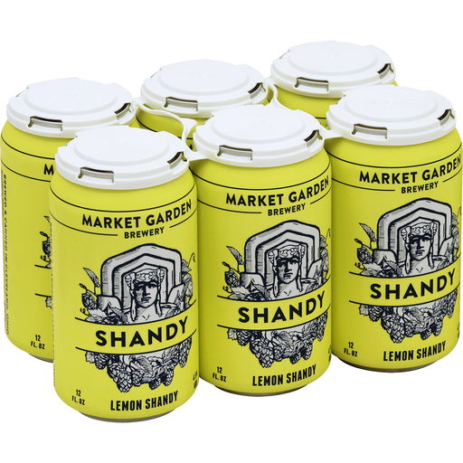
If anything, it's because McNulty and Market Garden Brewery might already have it.

logo.png


All of their merchandise, beers, etc have a bridge guardian on it.

9574710b4b9959c2d8ba011d3d6409c0_large.png


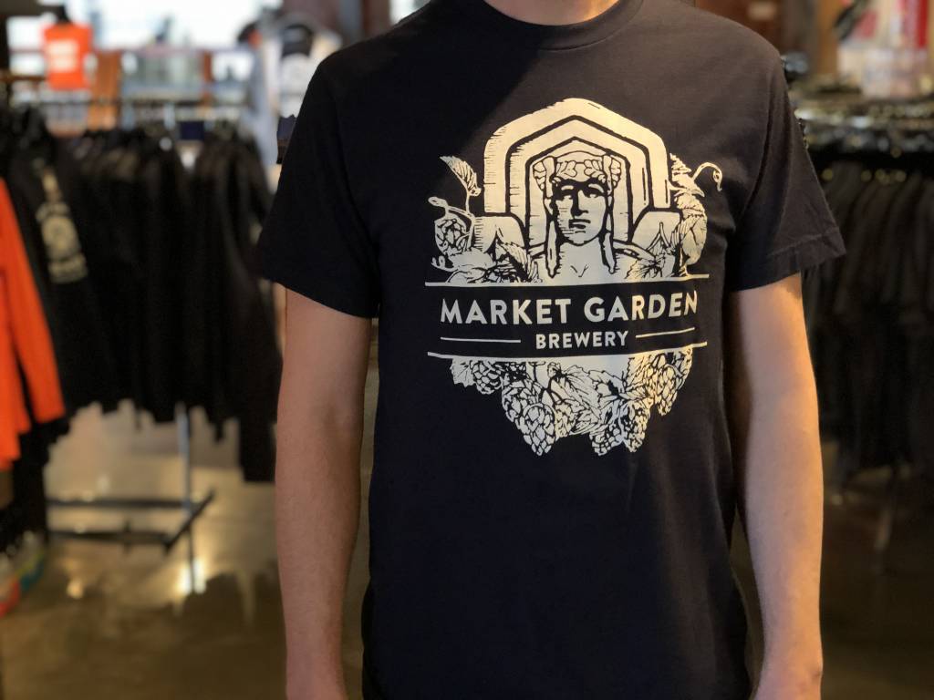
I bought one of their t-shirts as soon as they adopted the logo years ago. At least now I know what I'm wearing to beerfest at Progressive Field in a week.

guardian-t-shirt-navy.jpg


I bet there's something along the lines of Sam saying the team can use the image, but the Indians saying they won't be satisfied until they own it themselves--and Sam basically telling them "No, it's mine. I'm not abandoning it."
 
Status
Not open for further replies.

Rubber Rim Job Podcast Video

Episode 3-14: "Time for Playoff Vengeance on Mickey"

Rubber Rim Job Podcast Spotify

Episode 3:14: " Time for Playoff Vengeance on Mickey."
Top