• Changing RCF's index page, please click on "Forums" to access the forums.

New Uniforms!

Do Not Sell My Personal Information
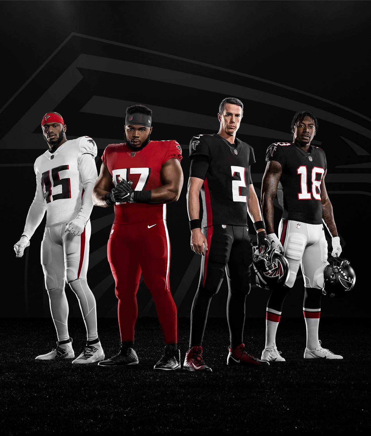
Well, we know the Browns won't have the worst new uniforms unveiled this offseason. Jesus, Falcons.

EVFsXRAVAAEaHCb

Falcons announce they’re taking their talents to the XFL this offseason.
 
Oh God. I didn't even notice that the red jersey has a freaking gradient! Even worse!
 
It didn't have to be that bad...

FxjlhWI.png
 
It didn't have to be that bad...

FxjlhWI.png
This is certainly better, but still doesn't completely fix these.

That font choice is amateur and is made even worse with the drop shadow. Super outdated design and one of the many flaws with the current Browns uniforms.

Who comes up with this shit? And who approves it?
 
This is certainly better, but still doesn't completely fix these.

That font choice is amateur and is made even worse with the drop shadow. Super outdated design and one of the many flaws with the current Browns uniforms.

Who comes up with this shit? And who approves it?

It's in line with the dumbing down of things. Simple colors, simple design, childish even.

BORING
 
Making more space for eventual sponsorship patches, like the NBA jerseys.

Just my hunch.
 
I'm kind of surprised so many people are flipping out about the Falcons jerseys....they're like a C+. Not good, not bad.

The gradient is funky and weird, whatever. The throwback blacks are super nice, Whites are nice, New black unis I could live without. But overall, the main problem (to me) is simply the numbers. I honestly think the only custom number set that looks better than a traditional round or block football style is the Vikings. Every other team, to me, has looked more tacky trying to come up with a number set that meshes with their logo.
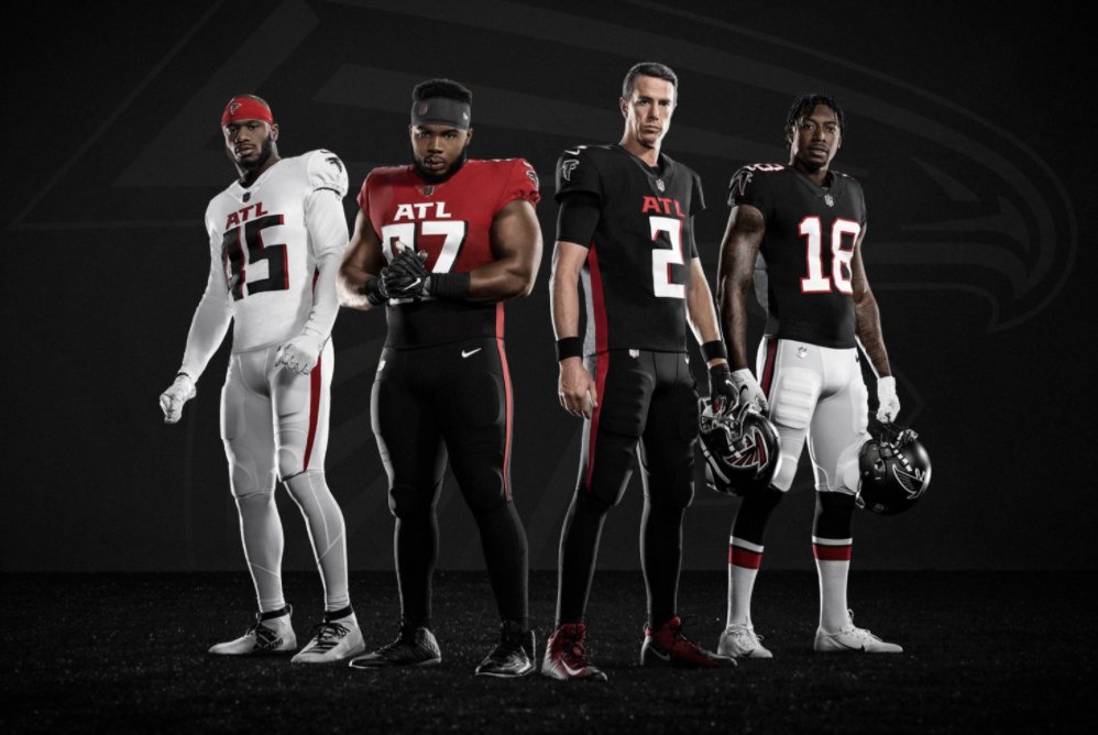
 
It's in line with the dumbing down of things. Simple colors, simple design, childish even.

BORING

But, look at the far right.

That's simple but it's vastly superior. It's their throwback uniforms.

This is what happens when you want to make a "modern" update on classic uniforms but keep the same feel. I fear what we are going to see with the Browns.

(I also really hate side panels on jerseys. Looks fucking dumb.}
 
the ATL thing is horrible. I hated the Cleveland thing, but at least it was giant and stupid, like the ATL thing. At least they didn't put "FALCONS!" on the leggings.
 

Rubber Rim Job Podcast Video

Episode 3-14: "Time for Playoff Vengeance on Mickey"

Rubber Rim Job Podcast Spotify

Episode 3:14: " Time for Playoff Vengeance on Mickey."
Top