• Changing RCF's index page, please click on "Forums" to access the forums.

New Uniforms!

Do Not Sell My Personal Information
I feel like 4 will probably win based on twitter reactions. The details are pretty cool as well.

I think 5 was kind of hilarious at first because it was so different from the other ones but I actually kind of like it. I think it likely would be more marketable.

The other ones are bad, imo.
 
This is how I would rank them personally.

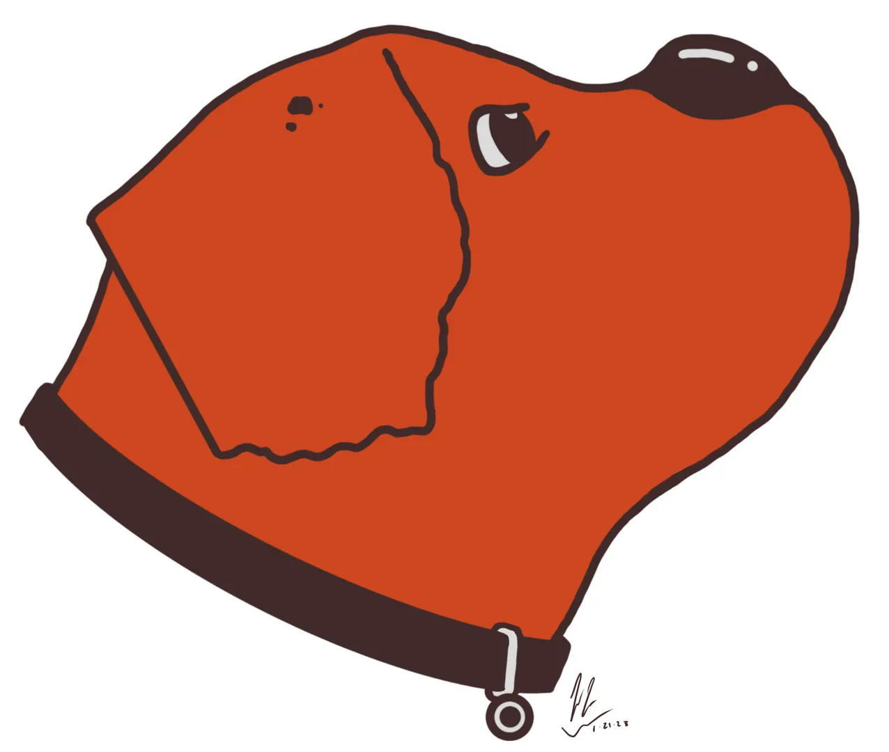
1. Solid logo. Doesn't wow me, but definitely the best of the bunch in my opinion.
1683560519003.png

2. A little more dopey than the first logo, but I like how simple it is.
1683560589415.png

3. A little too much going on for my liking, but it is kinda cool looking.
1683560629925.png

4. Not a fan, but I could maybe see it growing on me over time. Definitely weaker than the other three though in my eyes.
1683560650074.png

5. Please no.
1683560669775.png
 
This is how I would rank them personally.

1. Solid logo. Doesn't wow me, but definitely the best of the bunch in my opinion.
View attachment 15372

2. A little more dopey than the first logo, but I like how simple it is.
View attachment 15373

3. A little too much going on for my liking, but it is kinda cool looking.
View attachment 15374

4. Not a fan, but I could maybe see it growing on me over time. Definitely weaker than the other three though in my eyes.
View attachment 15375

5. Please no.
View attachment 15376
I'd agree. 1 or 2 then there's a big gap to the rest.

These things need to be simple and reproducible on shirts and such while also looking good shrunk down on score widgets or whatever those are called.
 
This is how I would rank them personally.

1. Solid logo. Doesn't wow me, but definitely the best of the bunch in my opinion.
View attachment 15372

2. A little more dopey than the first logo, but I like how simple it is.
View attachment 15373

3. A little too much going on for my liking, but it is kinda cool looking.
View attachment 15374

4. Not a fan, but I could maybe see it growing on me over time. Definitely weaker than the other three though in my eyes.
View attachment 15375

5. Please no.
View attachment 15376
In my opinion Option 3 is the best. It’s at least tough and not as “cartoony” as the top 2 or as “cheesy” as the bottom 2…
 
This is how I would rank them personally.

1. Solid logo. Doesn't wow me, but definitely the best of the bunch in my opinion.
View attachment 15372

2. A little more dopey than the first logo, but I like how simple it is.
View attachment 15373

3. A little too much going on for my liking, but it is kinda cool looking.
View attachment 15374

4. Not a fan, but I could maybe see it growing on me over time. Definitely weaker than the other three though in my eyes.
View attachment 15375

5. Please no.
View attachment 15376
Flip two and three. 1 and 3 are my top options.
 
Three just looks like the bears concept with a dog.

The best one didn't make it to this round
 
Does anyone else think the orange in these is becoming closer to red? Did they change it again to match the passion of the Dawg Pound?
 
Does anyone else think the orange in these is becoming closer to red? Did they change it again to match the passion of the Dawg Pound?
Yes. It camouflages the blood of the vanquished.
 
This is how I would rank them personally.

1. Solid logo. Doesn't wow me, but definitely the best of the bunch in my opinion.
View attachment 15372

2. A little more dopey than the first logo, but I like how simple it is.
View attachment 15373

3. A little too much going on for my liking, but it is kinda cool looking.
View attachment 15374

4. Not a fan, but I could maybe see it growing on me over time. Definitely weaker than the other three though in my eyes.
View attachment 15375

5. Please no.
View attachment 15376

#2 seems like the best one to me. Kind of gives me a bit of a similar feel style-wise as Brownie the Elf which I think is cool. All the others seem to be trying too hard to be edgy and modern. Out of all of these designs, I think that would actually look the best on merch. #3 is cool too, but there's a lot going on.

However, the truth is we were robbed of our real destiny. I hope this contest was nothing but a farce and we will be rewarded with our true champion:

0858cd89-2d4f-48b7-aa64-add8e0180991_large.webp
 
I’m team 4 as well. It’s the only one I wouldn’t laugh at if I saw someone wearing it on a shirt or hat.

The idea of 5 is cool but there’s just way too damn much going on. Plus, his mouth looks like a circus tent .
 

Rubber Rim Job Podcast Video

Episode 3-15: "Cavs Survive and Advance"

Rubber Rim Job Podcast Spotify

Episode 3:15: Cavs Survive and Advance
Top