-
Changing RCF's index page, please click on "Forums" to access the forums.
You are using an out of date browser. It may not display this or other websites correctly.
You should upgrade or use an alternative browser.
You should upgrade or use an alternative browser.
TIME FOR NEW JERSEY DESIGNS. New era = New look... (post #847)
- Thread starter I-77 NORTH
- Start date
Green Lantern
Guardian of the Cavaliers
- Joined
- Sep 28, 2007
- Messages
- 7,997
- Reaction score
- 3,297
- Points
- 113
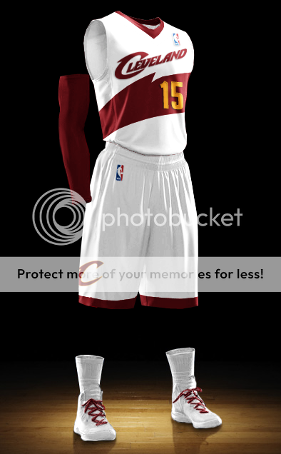
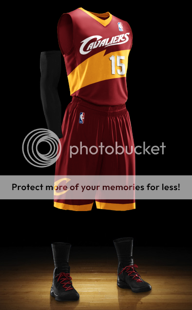
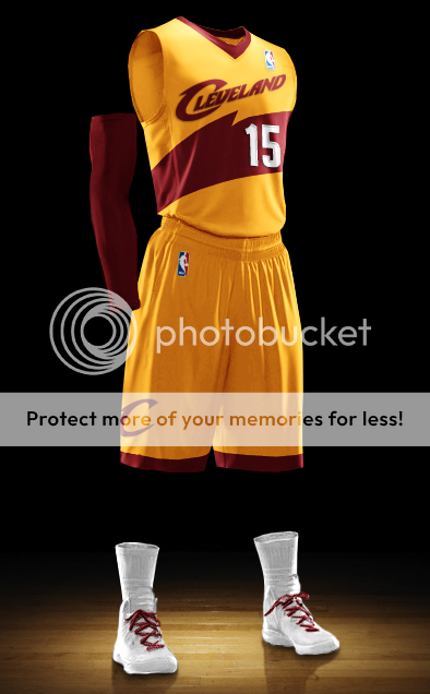
I like this.."I LIKE IT ALOT"Looks like one of those knockoff sites made a couple of my jerseys come to life.
http://www.joyfuljerseys.ru/cleveland-cavaliers-c-49_52
A Squared
Don't just stare at it..
- Joined
- Apr 10, 2009
- Messages
- 2,397
- Reaction score
- 3,550
- Points
- 113
http://imgur.com/a/YRH42
Here is a version without navy or the glow behind the skyline.
Here is a version without navy or the glow behind the skyline.
Mr. Glass
NBA Starter
- Joined
- Sep 28, 2008
- Messages
- 3,085
- Reaction score
- 2,514
- Points
- 113
I think removing the glow was a good step forward for this design. Frankly, I think these are very cool and would make an excellent alternate set.http://imgur.com/a/YRH42
Here is a version without navy or the glow behind the skyline.
Danny DiVito
In the Rotation
- Joined
- Apr 19, 2009
- Messages
- 960
- Reaction score
- 644
- Points
- 93

Those are looking too much like these.
They catch the eye at first, but I think they would get old. Rather than fading the color transition, I'd try a trio of colors over just two. Generally things in diagonals can be visually interesting. Let's get some three color, diagonal color separations.
Nothing about Cleveland is regal, wine, gold.... we're rust belt, black iron, industrial has been.
I say that in a positive way. We as fans embrace what we do have, even if it's ugly to the outsiders. You know the saying, Cleveland; you got to be tough. That's the identity of the area.
I'm a huge fan of grey tones, especially in different shades.
When a team chooses grey, it's always one grey. I'd like multiple shades of grey as an auxiliary accent. After all, the basketball season isn't played with blue skies and sunshine in Cleveland.
With LeBron coming back repping Ohio as hard as he's been, I don't find our colors representative at all. The wine, because of passion, because of the richness of blood, the thirst for more..... Red (wine) can be used.
Gold? Gold? Nothing about Cleveland says gold. Let's adopt that when we get rings, but still nothing about Cleveland says royalty, prestige, rarity.....
Embrace the Grey.
Cleveland is "craving" gold. That's where the gold comes from
Seriously though. The colors are what they are. They started as wine and gold and should always be wine and gold. Why are the Browns colors brown and orange? It's just because. I'm not adverse to adding another color or shade in a minor way, but no way should the major colors of wine and gold be changed, ever.
MRMsix6
All-Star
- Joined
- Feb 14, 2009
- Messages
- 3,609
- Reaction score
- 8,058
- Points
- 113
Those are looking too much like these.
They catch the eye at first, but I think they would get old. Rather than fading the color transition, I'd try a trio of colors over just two. Generally things in diagonals can be visually interesting. Let's get some three color, diagonal color separations.
Nothing about Cleveland is regal, wine, gold.... we're rust belt, black iron, industrial has been.
I say that in a positive way. We as fans embrace what we do have, even if it's ugly to the outsiders. You know the saying, Cleveland; you got to be tough. That's the identity of the area.
I'm a huge fan of grey tones, especially in different shades.
When a team chooses grey, it's always one grey. I'd like multiple shades of grey as an auxiliary accent. After all, the basketball season isn't played with blue skies and sunshine in Cleveland.
With LeBron coming back repping Ohio as hard as he's been, I don't find our colors representative at all. The wine, because of passion, because of the richness of blood, the thirst for more..... Red (wine) can be used.
Gold? Gold? Nothing about Cleveland says gold. Let's adopt that when we get rings, but still nothing about Cleveland says royalty, prestige, rarity.....
Embrace the Grey.
I think I know what's on someone's reading list...
- Joined
- Jul 14, 2014
- Messages
- 4,157
- Reaction score
- 10,384
- Points
- 123
Jesus Christ.
Everything we wear is embarrassing
I'd rather wear this...

ssopata
Sixth Man
- Joined
- Feb 14, 2009
- Messages
- 1,505
- Reaction score
- 1,920
- Points
- 113

So we are wearing these on Christmas Day? Okay...
Thank you NBA and Adidas
Toph
Not sent from Tapatalk
- Joined
- Jan 3, 2012
- Messages
- 2,681
- Reaction score
- 2,370
- Points
- 113
So we are wearing these on Christmas Day? Okay...
They may not be the greatest but I think we can all agree that them not being sleeved in a huge win.
- Joined
- Aug 11, 2008
- Messages
- 12,566
- Reaction score
- 27,189
- Points
- 135
Nope. The sleeved ones last year are a million times better than these garbage jerseys.They may not be the greatest but I think we can all agree that them not being sleeved in a huge win.
Matches
Eloquently sarcastic
- Joined
- Oct 13, 2009
- Messages
- 544
- Reaction score
- 708
- Points
- 93
Both 2013 and 2014 are equally hideous. 2014 is better in that they are not sleeved, but the putting of the FIRST name on the back of the jersey, BELOW the number, pushes it into embarrassing territory. The purpose for all this is so that the NBA and Adidas can continue the tradition of giving out ugly-ass clothes on Christmas. 20 years from now all the NBA veterans can have an "ugly Christmas jersey" party where they dig one of these abominations out in an effort to win some sort of prize.
Walter White
Hall-of-Famer
- Joined
- Aug 11, 2008
- Messages
- 25,548
- Reaction score
- 19,211
- Points
- 123
Guys, check out this new jersey I created!!

Oh wait.... that is just our Christmas jersey.
Oh wait.... that is just our Christmas jersey.
Rubber Rim Job Podcast Video
Episode 3-14: "Time for Playoff Vengeance on Mickey"
Rubber Rim Job Podcast Spotify
Episode 3:14: " Time for Playoff Vengeance on Mickey."