-Akronite-
Hall-of-Famer
- Joined
- Jul 3, 2008
- Messages
- 11,020
- Reaction score
- 14,489
- Points
- 123
I think the orange is my favorite throwback, but I think our primary logos/uniforms should remain the current/classic wine & gold forever.
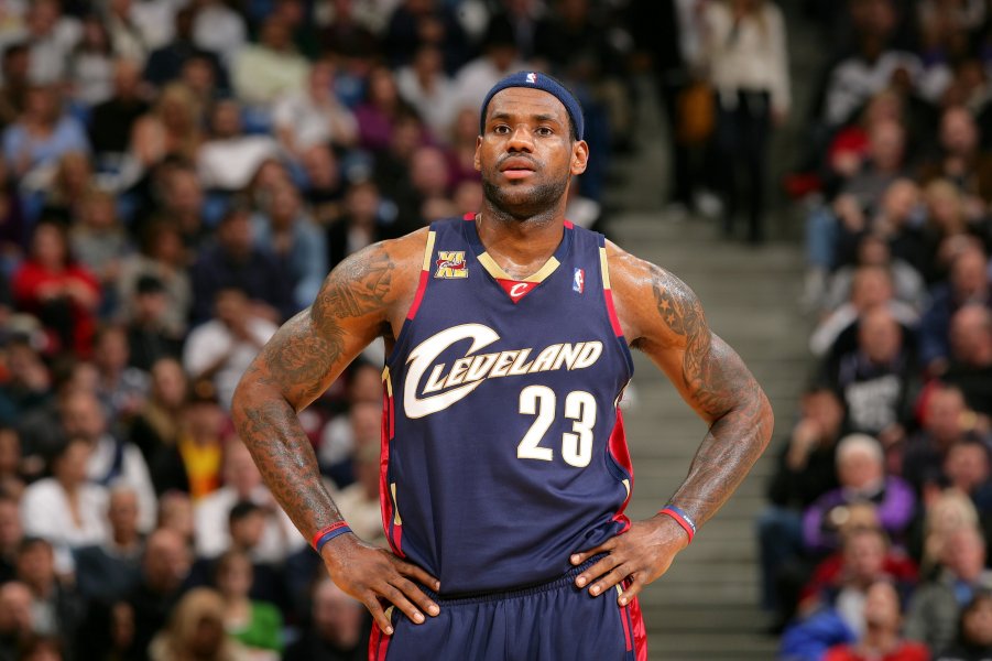
The 2022 City uniforms ruled and with the team’s surprise season it became very popular and seemed to be constantly sold out. The candy cane stripes always click for me when the team utilizes them. They happen to line up with our first playoff run (70s gold) and first finals run (05 navy). So to me we are wasting potential not to base our look around it. The modern state of NBA uniforms means we will get endless opportunities to use our various designs and colors, but I wish this team could establish a strong central identity and stick to it.
That said, I’d take a good number of uniform concepts over this current look, which lacks any character.


