• Changing RCF's index page, please click on "Forums" to access the forums.

The Gold is Golder: New uniforms to come?

Do Not Sell My Personal Information
I wish that they would’ve found a way to keep the swords involved with the new identity. After all, we are the Cavaliers. Even a secondary logo that looked something like the concept below would’ve been nice.

This was designed by Conrad Burry a few years ago. It uses athletic gold, but I think it’s a clean logo that does a good job combining the swords with a basketball, which most NBA logos incorporate.
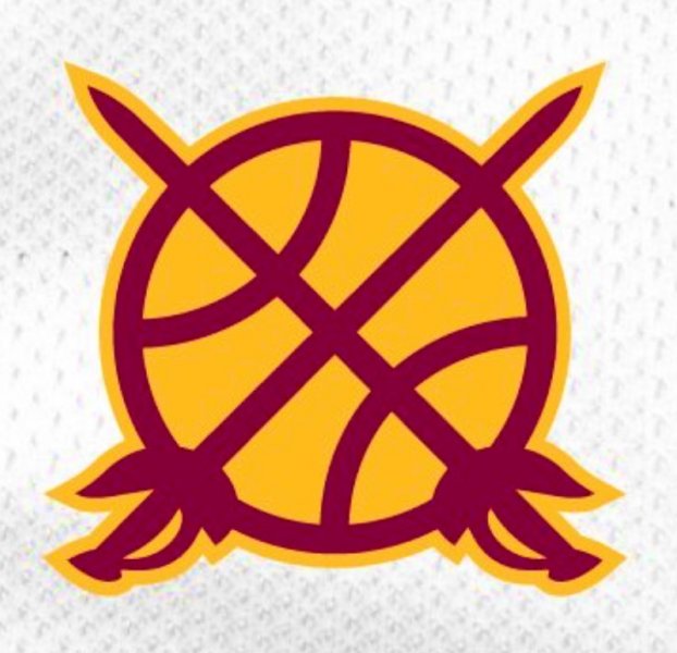
IMG_9066.JPG
 
Why can't we just have a classic looking jersey like the Celtics, Bulls, Lakers, Spurs, etc that looks good and doesn't have to change every 4-5 years?
The Cavs had one... in the 80s (specifically, the one in your profile picture). Every time they bring it back (even with Wine and Gold coloring) I want it to stay.
 
The Cavs had one... in the 80s (specifically, the one in your profile picture). Every time they bring it back (even with Wine and Gold coloring) I want it to stay.
Cmon... when you think blue and orange in basketball. Knicks will always be #1. Same with any team that does pinstripes in baseball, Yankees.

I do like how they have modernized that basket v in the Cavs branding. Like the Wine and Gold, but they haven't quite found the magic around it. The one that screams Cleveland Cavaliers. All the mocks that have the new CAVS typeface have potential. Just waiting to see what arsham drops...
that's my hope. That they make a modern version of that uniform, in the Wine and Gold, with the new logos.
 
Cmon... when you think blue and orange in basketball. Knicks will always be #1. Same with any team that does pinstripes in baseball, Yankees.

I do like how they have modernized that basket v in the Cavs branding. Like the Wine and Gold, but they haven't quite found the magic around it. The one that screams Cleveland Cavaliers. All the mocks that have the new CAVS typeface have potential. Just waiting to see what arsham drops...

The reason you think of the Knicks and Yankees is because the marketing behind it (along with being the largest market in the world). There aren't many (if any?) small, or even medium, markets that have the same brand recognition. It has little to do with design, colors, logos, etc, and has much more to do with the marketing around it.
 
The reason you think of the Knicks and Yankees is because the marketing behind it (along with being the largest market in the world). There aren't many (if any?) small, or even medium, markets that have the same brand recognition. It has little to do with design, colors, logos, etc, and has much more to do with the marketing around it.
Brown and orange is browns. Even their jerseys havent changed much over the years. same city even as the cavs, so it can be done.

They have potential with Wine and gold since the palate is unique to them in basketball. Hornets have a specific color and iconic jerseys from the mid nineties. I would even say the sonics have distinct uniforms and they don't exist.

Once franchise find a look that work, they then have the ability to build there brand and marketing. Closest for us is the Knicks knock off colors or lebrons first jerseys. They still have the ability to capitalize, but have to have a hit and then have the longevity
 
I wish that they would’ve found a way to keep the swords involved with the new identity.
I think the lower left side of the 'V' hoop represents the blade of a sword. It's subtle. It's an asymmetrical element. I dig it. May also be reading way too much into that :chuckle:

Wouldn't be too surprised to see the sword aspect remain in some fashion, but it's definitely not as explicit in the recent logos as it was in years past.
I hadn’t thought of that yet. Even if that wasn’t the intention, I like the thought!

Edit: good call!
 
Last edited:
I think the lower left side of the 'V' hoop represents the blade of a sword. It's subtle. It's an asymmetrical element. I dig it. May also be reading way too much into that :chuckle:

Wouldn't be too surprised to see the sword aspect remain in some fashion, but it's definitely not as explicit in the recent logos as it was in years past.
I noticed that as well and I believe you are correct - the 2017-2022 lettering font was inspired by the sword design.

From an NBA article about the Cavs uniforms in 2017:

“The wordmarks on each uniform introduce a new aggressive look. The sharp edges of the typeface are inspired from notions of a defender and the forward-like motion of the sword”
 
All of these golds need to be more pastel to contrast against the wine. A la saints
 

Rubber Rim Job Podcast Video

Episode 3-14: "Time for Playoff Vengeance on Mickey"

Rubber Rim Job Podcast Spotify

Episode 3:14: " Time for Playoff Vengeance on Mickey."
Top