• Changing RCF's index page, please click on "Forums" to access the forums.

The Gold is Golder: New uniforms to come?

Do Not Sell My Personal Information
Honest question: what separates a nicely designed uniform from a poorly designed one?
I mean, I can look at a uniform and say, "oh, I like how that looks" and then someone will say it looks like crap. Or, I think something looks like trash that others say is genius. Is it just a function of fashion being entirely subjective?
It's 1000% subjective so there is no criteria as to what separates good from bad. What one person likes the next person hates. I think these threads are silly for that reason. And so many people speak of their opinions as though they are indisputably correct, when such comments should be only offered in an "opinions are like assholes" sense.
 
I don’t remember the last time I saw a basketball jersey of any kind that I got excited about.

Feel like most of these designers start with some decent concept and can’t quit while they’re ahead.

I’d love to see something with a pastel white and neon black.
 
I don’t remember the last time I saw a basketball jersey of any kind that I got excited about.

Feel like most of these designers start with some decent concept and can’t quit while they’re ahead.

I’d love to see something with a pastel white and neon black.

I just hope whatever jerseys they decide on come out with hype videos.
 
If you mean the purple mountain jerseys, that's the throwback I was referencing. Their new primaries are black and yellow, which is perplexing.
Wait, that last one is their primary? I loved the non throwback purples they showed. The Steelers jerseys looked meh.
 
Wait, that last one is their primary? I loved the non throwback purples they showed. The Steelers jerseys looked meh.
Long story short, their new black and yellow uniforms leaked a couple months ago and they got ripped by pretty much everyone. The Jazz recognized this and wanted to scrap it but Nike refused because it was too late in the process. They’ll wear those this year- likely wearing the purple throwbacks the most- and introduce a new purple-based identity in 2023.
 
One and two do a great job of utilizing the colors in a new enough way, not retreading, making the logo and fonts work. Modern enough and throwback enough
I actually like these. They look pretty clean.
 
I don’t remember the last time I saw a basketball jersey of any kind that I got excited about.

Feel like most of these designers start with some decent concept and can’t quit while they’re ahead.

I’d love to see something with a pastel white and neon black.
Man really? Suns? Jazz sunburst? Miami vice city? Spurs throwback?
 
This is a hot topic
 
Man really? Suns? Jazz sunburst? Miami vice city? Spurs throwback?
I like that Jazz Sunburst one.

I have a pretty good idea of what I’d like if I saw it.

Standard font. White or primary color. Prominent stripes or checkerboard on the side or across the middle. Symmetrical.

I liked that navy Cavs one with the checker trim that they abandoned for god knows what reason.

Lot of the ABA stuff fits.

Missionary in the dark with no eyecontact and brief handjobs only for me, thank you.
 
Last edited:
Honest question: what separates a nicely designed uniform from a poorly designed one?
I mean, I can look at a uniform and say, "oh, I like how that looks" and then someone will say it looks like crap. Or, I think something looks like trash that others say is genius. Is it just a function of fashion being entirely subjective?

From my perspective as a designer: cohesiveness is the biggest thing. It’s why a lot of these mashups the Cavs have done lately look like shit. Mixing modern fonts and design elements with retro stuff typically never works out that well, especially when (in the Cavs case) a lot of the retro stuff wasn’t super popular to begin with.

It’s fine to have new uniforms that are inspired by old ones, but it’s typically very difficult to pull off because of the memories/feelings attached to the old branding. It’s why I’ve never understood the obsession with the 90’s “wave” jerseys. The team sucked, the colors were ugly, and the main element of the jersey was just some random graphic that had no relevance to the ‘Cavs’ theme or the city.

The biggest thing that’s been missing from the Cavaliers uniforms for much of the past 40 years is any reference to the theme ‘Cavaliers’. It kind of baffles me to be honest.


That’s not entirely true.


The ‘wave’ you’re referring to was actually a pretty thought-out design inspired by the move closer to Lake Erie - and to also commemorate the move from Richfield to Downtown Cleveland.

Paul Lucas (Uniwatch on Twitter) actually posted an article about the creation process for the 1994 Cavs uniforms - and the Cavs went through several different Cavs designs before settling with the ‘wave’ style uniform.

So the wave definitely isn’t some random design. It actually means more to the city than any other uniform design that we’ve donned since inception.

Also, the 2018-2019 city jerseys toasts as a nod to the wave as well as they incorporated it into their design.
 
Those blue and orange wave jerseys may be the worst of any sport of all time


Agreed. Looked like a ruffles cheddar and sour cream bag of chips.

However, the white and ice blue version was very under appreciated in my book.
 
That’s not entirely true.


The ‘wave’ you’re referring to was actually a pretty thought-out design inspired by the move closer to Lake Erie - and to also commemorate the move from Richfield to Downtown Cleveland.

Paul Lucas (Uniwatch on Twitter) actually posted an article about the creation process for the 1994 Cavs uniforms - and the Cavs went through several different Cavs designs before settling with the ‘wave’ style uniform.

So the wave definitely isn’t some random design. It actually means more to the city than any other uniform design that we’ve donned since inception.

Also, the 2018-2019 city jerseys toasts as a nod to the wave as well as they incorporated it into their design.

Was not aware of the tie. Thanks for sharing. Doesn’t get around the fact that those are some of the ugliest jerseys the team has ever worn, even if there actually was thought put into it.

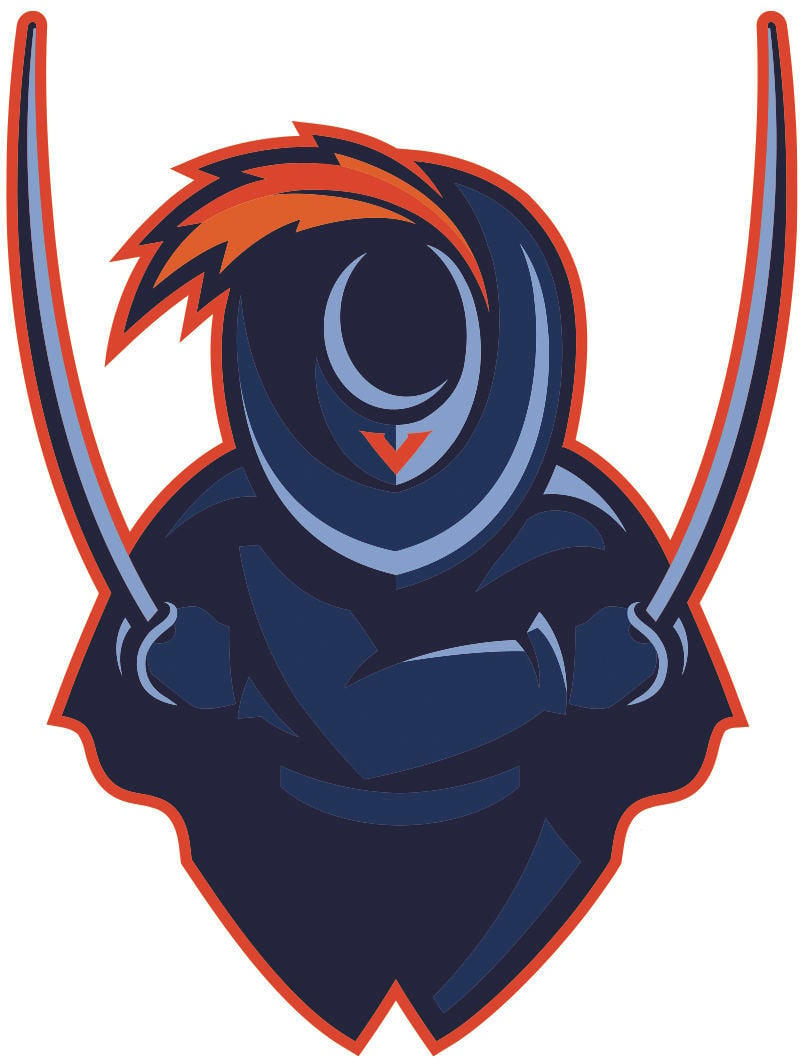
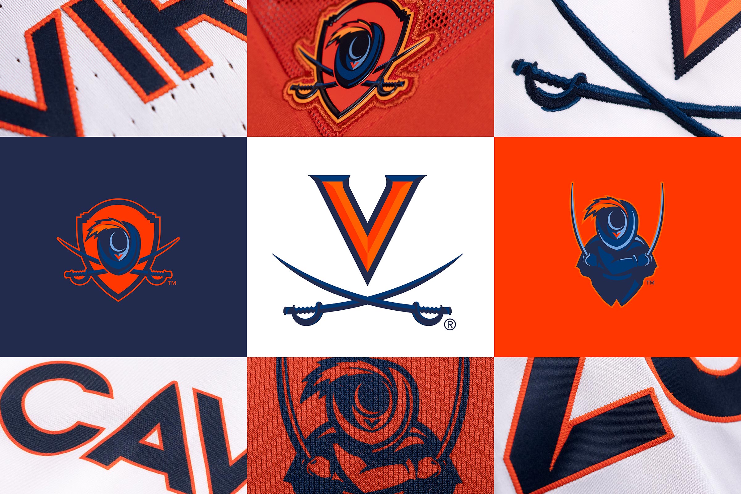
I’d just love to see us take a modern approach to the original cavalier logo. I though the new marks that Virginia released a year or two ago are pretty cool. I don’t completely love these, but I like the modern take as opposed to what we’ve been doing.


5ea373e714d42.image.jpg

new_marks_header_standard_feature.jpg

EAQUZH4PTBA3XPJTIIO3C2HXDI.png

I definitely get the sentiment that we should include some imagery that ties in with the team name, despite the Virginia Cavalier’s camel toe. :chuckle: The swords have been at least some part of our look since 2003, and there are definitely options to incorporate it.

Personally, the cavalier aesthetic doesn’t do much for me, tho. The feather in our original wordmark is inspired, but the hat and outfit for me is meh, our original logo doesn’t work, and I hate looking at Sir CC. Of course, design is very subjective and even thoughtful design can’t please everyone.

Whether they bring the sword back or not, I hope we keep the continuity of our C logo. It’s been around for nearly two decades and I think it looks good with or without the sword. Too bad we keep using inferior fonts but whatcha gonna do?
 

Rubber Rim Job Podcast Video

Episode 3-14: "Time for Playoff Vengeance on Mickey"

Rubber Rim Job Podcast Spotify

Episode 3:14: " Time for Playoff Vengeance on Mickey."
Top