-
Changing RCF's index page, please click on "Forums" to access the forums.
You are using an out of date browser. It may not display this or other websites correctly.
You should upgrade or use an alternative browser.
You should upgrade or use an alternative browser.
The Gold is Golder: New uniforms to come?
- Thread starter ajz20
- Start date
dark2332
Yeah, I’m thinking I’m back.
- Joined
- Jul 3, 2012
- Messages
- 10,807
- Reaction score
- 21,949
- Points
- 135
Most likely to be in August.surely they reveal them before draft? dont they present a jersey to the new players at a press conference the next day?
sailfish
The 52 year drought is over!
- Joined
- Aug 23, 2006
- Messages
- 6,939
- Reaction score
- 5,957
- Points
- 113
Yes, usually they do.surely they reveal them before draft? dont they present a jersey to the new players at a press conference the next day?
ManOfTheLand
Towel Waver
- Joined
- Apr 19, 2022
- Messages
- 115
- Reaction score
- 174
- Points
- 43
I thought the same thing, but it’s actually not the case. For context, the Cavs’ last new uniform set was not unveiled until August 7th. We’ll likely have to wait a little bit longer for them to drop.surely they reveal them before draft? dont they present a jersey to the new players at a press conference the next day?
-Akronite-
Hall-of-Famer
- Joined
- Jul 3, 2008
- Messages
- 10,996
- Reaction score
- 14,442
- Points
- 123
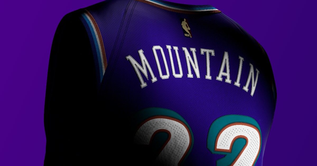

For all the chaos that has been the Cavs identity over the years, let's be thankful we are not the Utah Jazz, who designed new uniforms so pointless they needed to center their marketing campaign on the throwbacks.
Alec
All-Star
- Joined
- May 21, 2011
- Messages
- 7,250
- Reaction score
- 9,963
- Points
- 113
all trash. But honestly, the black shield is really bad. I’ll take anything over that.
prf100
All-Star
- Joined
- Jun 26, 2008
- Messages
- 3,351
- Reaction score
- 8,822
- Points
- 113
Honest question: what separates a nicely designed uniform from a poorly designed one?
I mean, I can look at a uniform and say, "oh, I like how that looks" and then someone will say it looks like crap. Or, I think something looks like trash that others say is genius. Is it just a function of fashion being entirely subjective?
I mean, I can look at a uniform and say, "oh, I like how that looks" and then someone will say it looks like crap. Or, I think something looks like trash that others say is genius. Is it just a function of fashion being entirely subjective?
ManOfTheLand
Towel Waver
- Joined
- Apr 19, 2022
- Messages
- 115
- Reaction score
- 174
- Points
- 43
In my opinion, the most objective way at determining that is how closely it aligns with current industry trends and whether or not the uniform has a singular identity.Honest question: what separates a nicely designed uniform from a poorly designed one?
I mean, I can look at a uniform and say, "oh, I like how that looks" and then someone will say it looks like crap. Or, I think something looks like trash that others say is genius. Is it just a function of fashion being entirely subjective?
The “trend” for uniforms right now seems to be simple, 2D designs across the entire identity. I think the reason why a lot of late 90s/early 2000s logos and uniforms haven’t aged well are because 3D designs were big and a lot of them were too busy. For example, the ‘sword across the basketball’ logo used until 2017 had three different features going on while using multiple primary colors. In contrast, the new ‘ball through hoop’ logo is a flat design that only uses one color.
Meanwhile, I think a lot of uniforms are deemed poor because they simply have too many different ideas going on. Take the uniform set shared above as an example. There’s three different types of stripes throughout some of the uniforms and it’s hard to get a consistent feel of the team’s main colors. The different looks can also make it easy to confuse it with another team’s identity, which is likely considered when determining how “good” a uniform looks.
I think that’s what makes designing an identity for the Cavs so difficult; they’re taking ideas from several different eras throughout the team’s history that go together like water and oil. Even the new updated logo contrasts with the rest of the typeface.
At the end of the day, most of it is just preference. However, I think there are a few correlations between design techniques and what people like. Again, just my opinion. Sorry for the long post!
Last edited:
prf100
All-Star
- Joined
- Jun 26, 2008
- Messages
- 3,351
- Reaction score
- 8,822
- Points
- 113
No need to apologize! I appreciate the explanation - gives me good perspective on how uniform design quality is judged.In my opinion, the most objective way at determining that is how closely it aligns with current industry trends and whether or not the uniform has a singular identity.
The “trend” for uniforms right now seems to be simple, 2D designs across the entire identity. I think the reason why a lot of late 90s/early 2000s logos and uniforms haven’t aged well are because 3D designs were big and a lot of them were too busy. For example, the ‘sword across the basketball’ logo used until 2018 had three different features going on while using multiple primary colors. In contrast, the new ‘ball through hoop’ logo is a flat design that only uses one color.
Meanwhile, I think a lot of uniforms are deemed poor because they simply have too many different ideas going on. Take the uniform set shared above as an example. There’s three different types of stripes throughout some of the uniforms and it’s hard to get a consistent feel of the team’s main colors. The different looks can also make it easy to confuse it with another team’s identity, which is likely considered when determining how “good” a uniform looks.
I think that’s what makes designing an identity for the Cavs is so difficult; they’re taking ideas from several different looks throughout the team’s history that go together like water and oil. Even the new updated logo contrasts with the rest of the typeface.
At the end of the day, most of it is just preference. However, I think there are a few correlations between design techniques and what people like. Again, just my opinion. Sorry for the long post!
Houston RZ34
Cleveland Born and Raised
- Joined
- Jun 4, 2007
- Messages
- 1,663
- Reaction score
- 582
- Points
- 113
Also might be a good guess blending some continuity from current sets—
This is a winner but, I want the Wine Aways to say "Cleveland"
foucault87
All-Star
- Joined
- Dec 20, 2009
- Messages
- 7,033
- Reaction score
- 9,224
- Points
- 113
I just want a jersey with pale nimbus and something with the color bone. Ideally there is also a watermark
prf100
All-Star
- Joined
- Jun 26, 2008
- Messages
- 3,351
- Reaction score
- 8,822
- Points
- 113
I just want a jersey with pale nimbus and something with the color bone. Ideally there is also a watermark

-Akronite-
Hall-of-Famer
- Joined
- Jul 3, 2008
- Messages
- 10,996
- Reaction score
- 14,442
- Points
- 123
I actually love those jazz uniforms, they've all sucked ass since they got rid of them (except the new sunburst)
If you mean the purple mountain jerseys, that's the throwback I was referencing. Their new primaries are black and yellow, which is perplexing.
JJ_PR
Sixth Man
- Joined
- Jul 14, 2014
- Messages
- 1,186
- Reaction score
- 1,182
- Points
- 113
I actually like these. They look pretty clean.
Rubber Rim Job Podcast Video
Episode 3-14: "Time for Playoff Vengeance on Mickey"
Rubber Rim Job Podcast Spotify
Episode 3:14: " Time for Playoff Vengeance on Mickey."